> ## Documentation Index
> Fetch the complete documentation index at: https://docs.meetdarwin.ai/llms.txt
> Use this file to discover all available pages before exploring further.
# Make the chat look like your brand
> Style the real widget from the launcher to the booking experience.
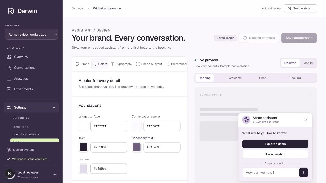
Screenshots use a demonstration workspace. Your data, plan, and activation status may differ.
The appearance editor changes the embedded chat, not your Darwin admin workspace. The preview uses the same widget components as the embed, with a sample conversation.
Open **Brand** and choose a preset. Pick an avatar style: brand symbol, custom image, initials, or no avatar. Upload a PNG, JPEG, or WebP image, or use a public HTTPS image URL. Choose whether the launcher uses a chat symbol or the avatar.
Open **Colors**. Edit the surfaces, text, buttons, header, messages, input, teaser, launcher, links, and feedback colors. Enter six-digit hex values for exact brand matching. Review any contrast warnings before saving.
In **Typography**, choose a font family or supply an HTTPS font URL, then set text size, weights, line height, and spacing. In **Shape & layout**, adjust corners, borders, shadows, panel size, launcher size, position, and screen offsets.
Switch between **Opening**, **Welcome**, **Chat**, and **Booking**, then compare **Desktop** and **Mobile**. Check that long messages remain readable and that the launcher does not cover your website’s important controls.
Select **Save appearance**. Previewing, importing, or choosing a preset changes a draft until you save. Reload your website after saving and check the live widget in a fresh session.
## Useful controls
| Area | Controls |
| ------------------ | -------------------------------------------------------------------------------------------- |
| **Brand** | Avatar, avatar size and corners, launcher icon, agent role visibility. |
| **Colors** | Separate foreground and background values across every major widget state. |
| **Typography** | Font source and fallbacks, body and heading sizes, weights, line height, letter spacing. |
| **Shape & layout** | Panel, bubble, button and input corners; width, height, padding, borders, shadows, position. |
| **Preferences** | Motion, attribution where your plan permits, theme import/export, reset. |
Origin and Adapt retain Darwin branding. Evolve and Apex allow its removal. Your plan enforces this even if an imported theme asks to hide it.
**Export theme** saves a reusable JSON file. **Import theme** and **Reset to Darwin** update the draft; review and save to apply them. The appearance preview does not create real leads, conversations, or bookings.